Inclusive Teaching Toolkit
Designing a Living Resource for Inclusive Education
Creating accessible resources and tools to support inclusive teaching practices through community-driven design and research methodologies.

Overview
When I joined the multi-quarter Directed Research Group (DRG) tasked with building the Inclusive Teaching Toolkit, I aimed to create more than just a resource hub—I wanted to design a dynamic, living framework that grows with the HCDE community. Collaborating with faculty, students, and DEI (Diversity, Equity, & Inclusion) committee members, we built a digital toolkit that bridges gaps in inclusive teaching practices, ensuring both students and instructors have accessible, actionable tools at their fingertips.
What is the Toolkit?
A living, modular collection of inclusive education resources co-created by HCDE students and faculty. Designed to support instructors and students in applying equity-centered practices in the classroom.
Why “Toolkit”?
These are adaptable tools—not prescriptive rules. Users are encouraged to take what’s useful and leave what doesn’t apply.
Why “Living”?
The toolkit evolves with the community. Contributions are ongoing, ensuring relevance and sustainability.
Role Overview
Highlights my role as UX Designer & Researcher at UW in a DRG over two academic quarters.
Team
Collaborated with 6 DRG students plus faculty mentors to drive research and design.
Institution
Work anchored in HCDE at the University of Washington with cross-campus stakeholders.
Timeline
Engaged across two academic quarters (2023–2024) for iterative research and design.
Collaborators
Faculty mentors and contributors supported research outcomes and guidance.
My Role
Led UX Writing, Content Design, and Usability Testing. Adjusted the visual hierarchy, language clarity, and the depth of DEI guidance to ensure the toolkit remained usable and respectful across different perspectives.
Anushreya Karir — UX Writer & Content Designer
Focus Areas
Project Goals
Guiding principles we used to design the Inclusive Teaching toolkit.
Design for Clarity
Create clear, scannable templates and modular content blocks that instructors and students can easily adopt.
Accessibility First
Prioritize semantic structure, keyboard interactions, and readable content so the toolkit works for everyone.
Community-Driven
Design contribution flows and governance to make the toolkit editable, discoverable, and maintained by the HCDE community.
Sustainability
Establish contributor roles, moderation, and lightweight governance so the toolkit remains current and trustworthy.
Problem Statement
How do we design something that adapts over time—without becoming another static document?
Ideation and Design Process
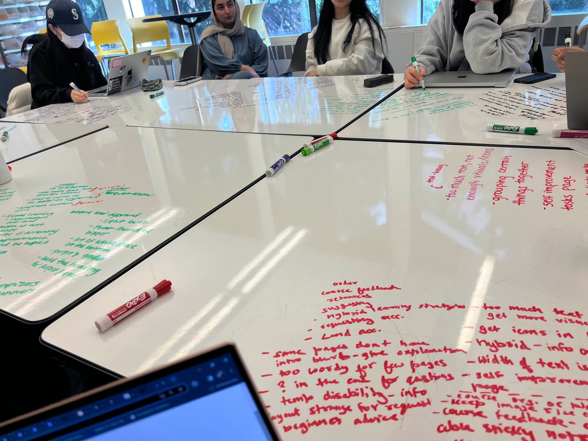
Faculty and students in HCDE struggled with fragmented DEI resources—scattered across PDFs, emails, and one-off workshops.
Instructors lacked clear guidance on religious accommodations, hybrid learning accessibility, and inclusive feedback systems.
Students wanted actionable ways to advocate for inclusivity but found existing resources hard to locate or use.
Conversations around diversity often stalled at land acknowledgments without deeper engagement in equity-centered teaching.
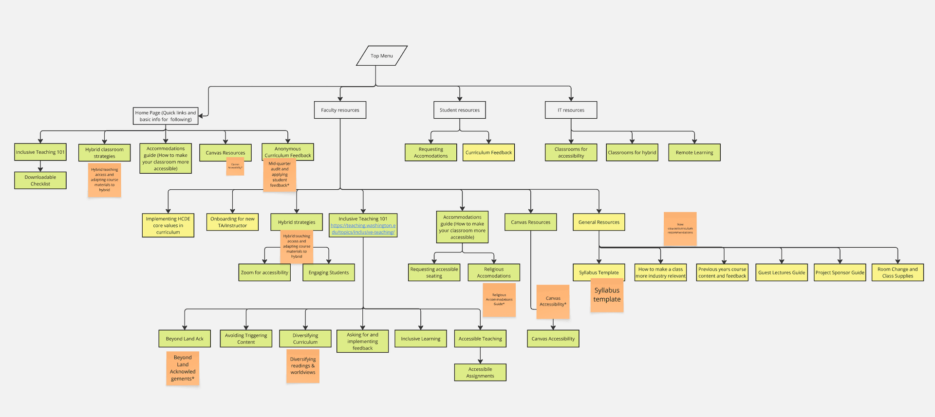
Information Architecture Evolution
Initial Information Architecture
Early IA showing linear structure with limited pathways for different user types • Click to expand
Final Information Architecture
Final IA showing dual pathways and modular structure with improved user flows • Click to expand
Key Architecture Improvements
User Research & Insights
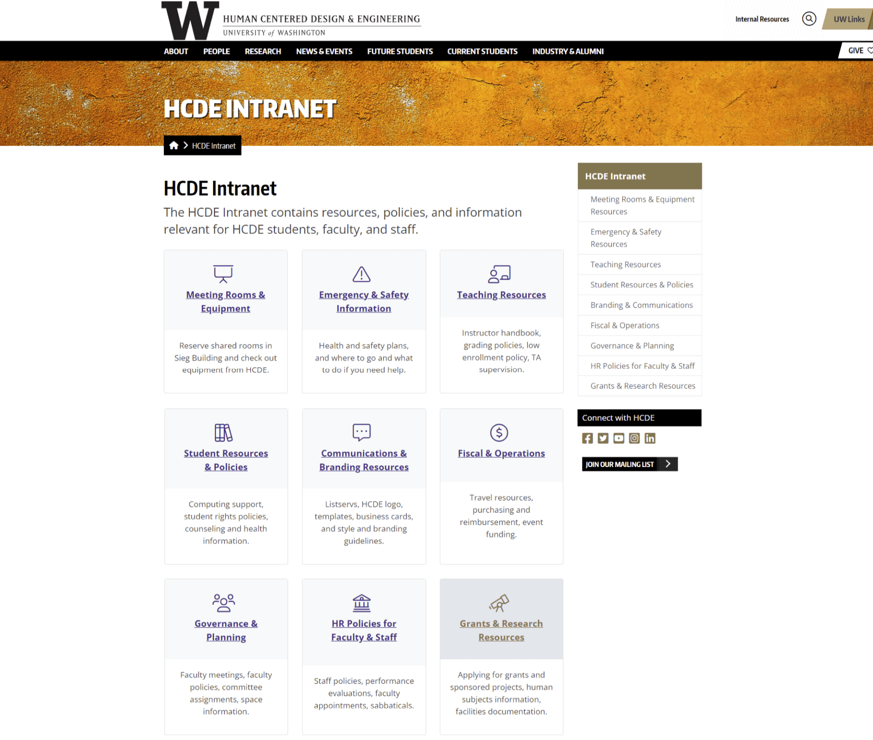
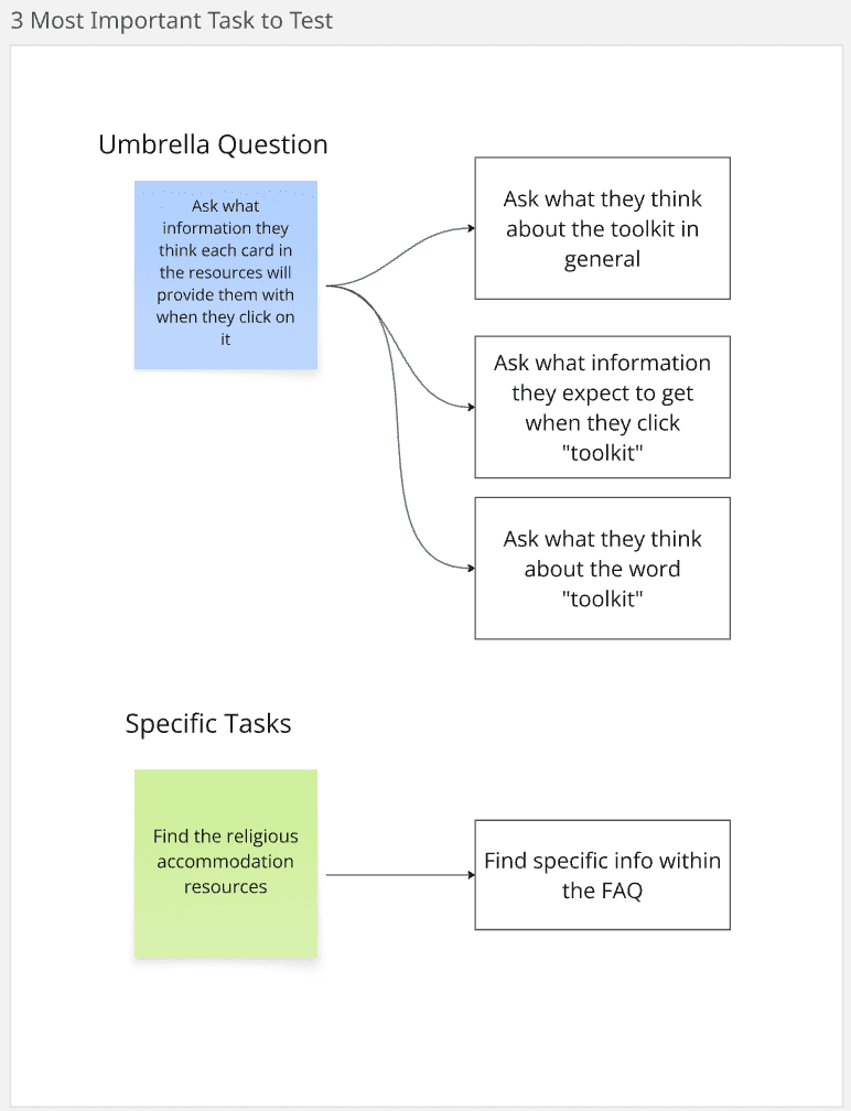
I conducted semi-structured interviews with students, faculty, and staff to understand how users interpret resource categories like "Toolkit," "Intranet," and "Accommodations," and identify navigation pain points.
Sample Questions Asked:
- •"How do you currently find resources like accommodations or IT support?"
- •"What does the term 'Toolkit' mean to you?"
- •"Would you expect to find course feedback under student or faculty resources?"
- •"What section would you go to for hybrid learning strategies?"
Key Insights:
Impact on Design:
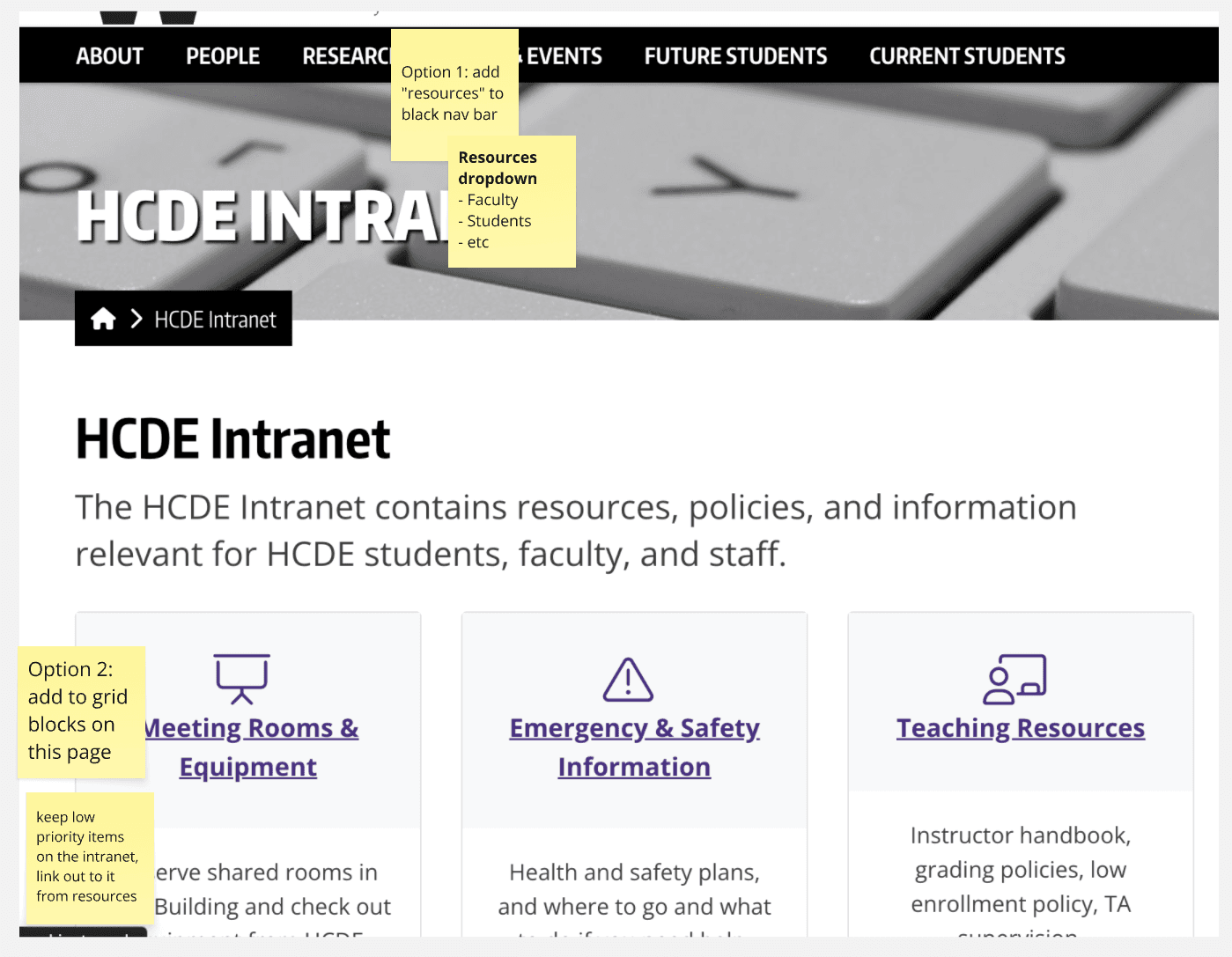
These findings led to two IA options:
- 1.Add Toolkit to the existing Intranet.
- 2.Combine Toolkit and Intranet under a unified "Resources" section.
The interviews directly informed A/B testing of card order and category labeling in subsequent prototypes.
Research Process:
Prototyping & Iteration
Design System & Guidelines
Established a lightweight, accessible design system to keep the toolkit cohesive and easy to contribute to.
HCDE Branding & Communications
HCDE crafts a unique departmental identity while staying cohesive with the University of Washington brand.
The visual system combines UW signature elements (purple, Encode Sans typeface) with flexible layouts and explorative graphics to build a distinct departmental tone.
Color Palette
Primary brand colors and neutrals used across the toolkit.
Spacing & Layout Guidelines
- Padding between different content sections: 60px
- Padding between paragraphs: 16px
- Padding in dropdown box
- Between text and top/bottom within dropdown box: 16px
- Between body text and top/bottom within dropdown box: 20px
- Padding between heading and body text: 26px
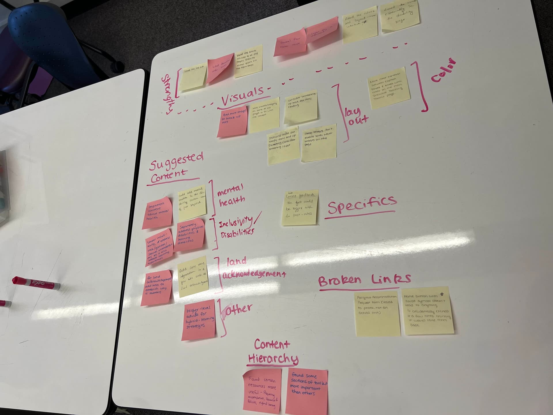
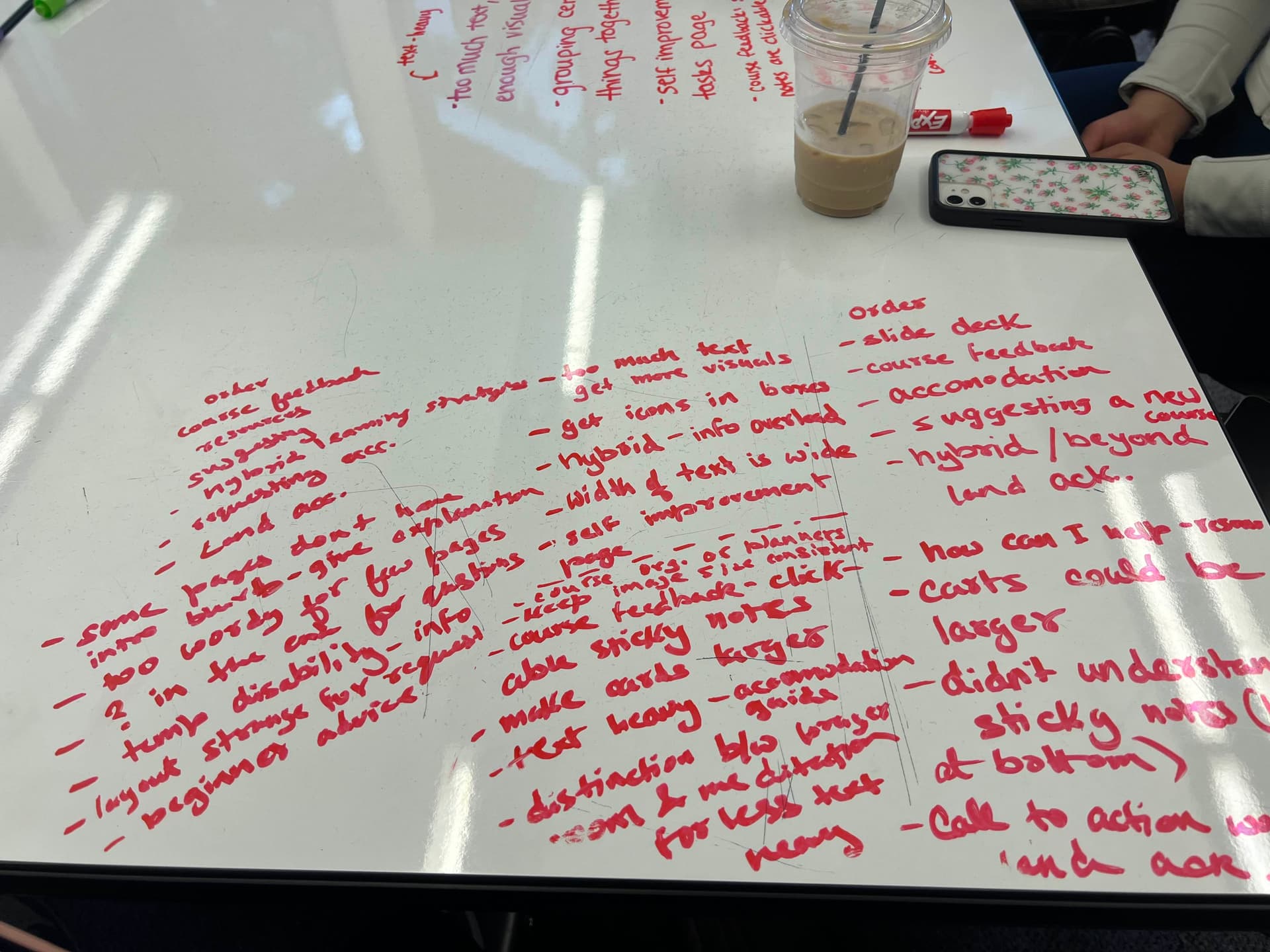
Usability Testing & Iteration
Led structured testing with faculty and students across class years.
Issues and Actions
| Issue Found | Action Taken |
|---|---|
| Back-navigation unclear | Added sticky "Back" button & breadcrumb logic |
| Low contrast in quote blocks | Adjusted color hierarchy & font pairings |
| Students wanted real-world examples | Added scenario-based tips for hybrid learning & accessibility |
| Feedback form wording confusing | Reworked form logic for clarity |
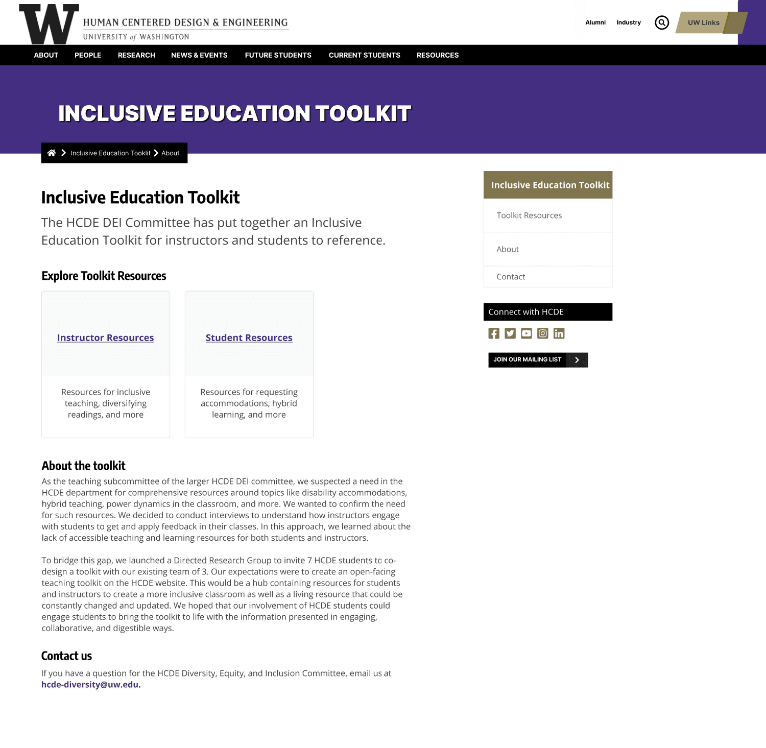
Final Prototype
Interactive Prototype
Experience the full interactive prototype with dual-pathway navigation, modular content organization, and responsive design patterns.
Solution Overview
The final prototype implements a dual-pathway navigation system that adapts to different user needs while maintaining a cohesive, accessible experience for the inclusive teaching community.
Key Features
- for flexible content discovery
- Separate landing pages for instructors and students
- Streamlined feedback and contribution workflows
- Comprehensive resource categorization
Design Principles
- Progressive disclosure for complex information
- Inclusive language and accessible interactions
- Community-driven content contribution
- Scalable, maintainable architecture
Design Metaphor: A toolbox—pick what's useful, leave what's not, and always have space to add new tools.
Navigation Architecture
System architecture displaying the dual-pathway structure, content organization, and user flow patterns that support both instructor and student journeys through the toolkit.
Crafting an Inclusive Voice
I wrote clear, equity-centered content that empowers users:
- Welcoming homepage copy
- Step-by-step contribution guidance
- Student-focused language
- Microcopy, tooltips, accessibility notes
Interactive annotations showing content strategy and user experience considerations
Content Hierarchy
Prioritized essential resources at the top while moving low-priority items toward the bottom, ensuring users can quickly find what they need without cognitive overload.
Accessibility-First Language
Used clear, jargon-free language with descriptive labels and helpful tooltips to ensure all users, regardless of technical expertise, can navigate confidently.
Outcome & Impact
Successfully piloted in Spring 2024
The toolkit was successfully implemented and tested with real faculty and students during the Spring 2024 semester, providing valuable insights for future iterations.
Toolkit structure ready for future DRG iterations
The modular design framework provides a scalable foundation that can be adapted and expanded for future Directed Research Group projects and initiatives.
Sparked faculty interest in syllabus integration
Faculty members expressed enthusiasm for incorporating DEI principles directly into their course syllabi, creating lasting institutional change beyond individual projects.
Positive feedback from students and instructors
Both students and instructors provided encouraging feedback, highlighting the toolkit's accessibility, practical utility, and potential for creating more inclusive learning environments.
What I Learned
Inclusive design requires flexibility and iteration
Building truly inclusive experiences isn't a one-time effort—it demands continuous adaptation based on user feedback and evolving needs. The toolkit's modular structure proved essential for incorporating new insights and maintaining relevance.
Diverse perspectives reveal hidden accessibility needs
Working with faculty and students from different backgrounds uncovered accessibility barriers I hadn't initially considered. Each perspective brought unique insights that strengthened the overall design and made it more universally usable.
Small UX details (like navigation and microcopy) have outsized impact
Seemingly minor elements—clear back buttons, thoughtful form labels, and inclusive language—often determined whether users felt welcomed or frustrated. These details became the foundation of user trust and engagement.